3D Graffiti Text Logo Generator
It's the most versatile and customizable 3D graffiti editor online. By using this free graffiti text generator, you can design cool 3D graffiti letters, names and banners with the best graffiti fonts available.
When using this free graffiti text editor to design an online graffiti writing or word art, you can choose among many cool graffiti styles to produce high quality graffiti logos with your name, message, slogan, or any graffiti words or letters you need to your header, title, cover, page, blog, site, app, game, software interface, party, event, Facebook, Twitter, social image, wallpaper, graphic design, image composition or whatever you want.
Using a so configurable online graffiti text editor can be a little tricky. If you are a new user, spend some moments reading the tips below. They can be very useful to help to learn how to use this cool graffiti creator.
You could like to know all our most popular graffiti creator apps to decide what's the best way to make your own graffiti. Feel inspired to graffiti your name or even your photo.
IMPORTANT TIPS:
- Since this graffiti generator is very powerful and has many configuration options, the interface items are grouped in sections to help you. Pay attention to them.
- The rendering process recognizes three main layer sets: back, middle and front (the text layer set). The first two ones are optional and it could be a good idea to set them off while you learn how to use nicely the many graffiti text attributes.
- The gradient style and colors configuration works similarly for all layer sets. When you get used to it for the text layer set, probably you will be able to use it smoothly for all three ones.
- Don't confuse the "back drawing layer set" with the "background". The last one is about the image you can use as "where" the graffiti text will be painted (in fact, where all layers will be painted). The background is optional too (you should let it off until you understand how to configure the text layer).
- The "Background" interface section is not only to choose a texture to paint over. There you set how the graffiti drawing will lay on the "texture surface". These items affect the graffiti spatial disposition and the resulting colors. Understanding that options can be very important to get the most realistic results, mainly when choosing some back textures that are harder to use because they are more irregular or have saturated colors. Anyway, the default values are good for many backgrounds, mainly the plainest ones.
- As a general rule, strong colors for all drawing sets (mainly the text one) are easier to use and combine with backgrounds; try to follow this tip if you have problems with the color compositions. If you intend to create a graffiti text without a background image, all colors are equally easy to use.
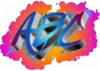
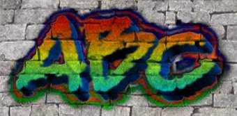
Graffiti Text Logo Effect 1
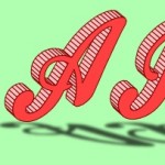
Graffiti Text Logo Effect 2